


Are you interested in selling products online or thriving as a virtual service provider? Then, you must pay attention to your website’s UI/UX. When surfing the internet, you’ll find tens of thousands of websites. It’s clear that the competition to stand out is intense.
A poor user interface will make your website suffer, but luckily, there are plenty of templates to learn from. If you’re struggling to get your UI design right, this piece will review websites with the best UI/UX practices and show you how they did it.
Top 10 Websites With Impeccable UI/UX Design
1. Netflix
Ever wanted to binge-watch your favorite television series? Netflix is your best bet and clearly, its developers don’t want to own a regular streaming platform.
They’re interested in creating a unique experience for all users and that’s why they’ve designed this platform to track online activity and engagement. Based on your past viewings, the platform will recommend diverse alternatives that’ll keep you around longer.
What UI/UX Trends Does Netflix Use?
Consider the following standout UI trends adopted by Netflix:
- User-Centered Algorithm: After creating a Netflix account, its platform will begin to assess your taste and demands and you’ll get the chance to enjoy a website that offers recommendations based on personal preferences.
- Diverse Content: On Netflix, there’s plenty of content to engage and watch, and you’ll also find a long list of movie genres originating from different parts of the world on this platform.
- Seamless Integration: Netflix’s website supports a high level of integration ensuring that you can access your account through your mobile device, laptop, or smart television. You’ll enjoy a similar experience on each of them.
- Continuous Improvement: There’s no gain in saying Netflix isn’t committed to constant improvement because you’ll find notable changes in their website layout from time to time.
- High-Quality Visuals: You’ll be thrilled at the attractive thumbnails and preview videos used by this platform to boost customer interest.
Learn more about UI design mistakes to avoid.
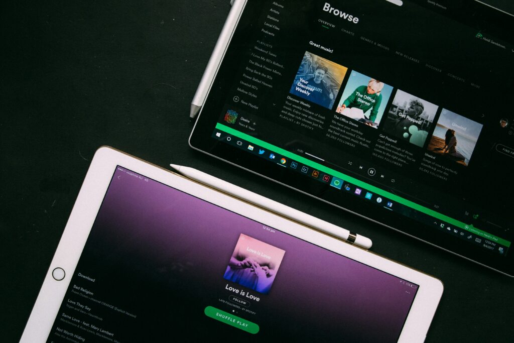
2. Spotify
Spotify currently ranks as one of the largest music streaming platforms worldwide while managing to create a unique online brand identity along with a remarkable user interface.
The Spotify website is a blend of aesthetics and functionality anyone will enjoy navigating the platform because of its attractive visuals.
Unlike other competitor UI designs that focus on visuals, Spotify displays a clear understanding of its users by adopting a layout with a dark background designed to prevent eye strain from prolonged exposure. Additionally, Spotify also excels at user personalization.
What’s the Unique Selling Point of Spotify?
- Innovative Layout: Spotify is relatively easy to use because of its well-designed layout and clear fonts that in your first few minutes, you’ll be able to navigate the platform without assistance.
- Dynamic Content Layout: If you use a Spotify account, there’s a high chance you’ll enjoy its dynamic homepage experience. This platform will add vibrant playlist covers to your homepage and also constantly update you on fresh content that matches your taste.
- Personalized Experience: To create a personalized experience, Spotify’s algorithm will track user activity to recommend new genres and artists because they aim to engage users for lengthy periods.
- Responsive Design: Spotify is one of the few online brands that have managed to create a uniform experience across smartphones, desktops, and tablets, and that’s why you can access your account through several channels and pick up almost like you never left.
- Consistency: Spotify’s website boasts a consistent color scheme and aesthetics on all its web pages ensuring they can create a uniform brand identity that’s easily recognizable anywhere.
3. Blinkist
Blinkist is one of the most comprehensive online libraries of nonfiction books. Whether it’s your first or fifteenth visit to the website, you’ll enjoy navigating its features. The entire layout is simple and highly functional.
While other online platforms prefer similar categorizations, Blinkist lays all its options out simultaneously. As a result, many visitors can find their favorite books easily.
What’s the Unique Selling Point of Blinkist?
- Clear Iconography: Blinkist’s clear iconography transforms abstract concepts into relatable symbols. They make it easier for you to navigate several web pages.
- Visual Minimalism: Blinkist’s website indicates that more isn’t always better. With a minimalistic and well-designed layout, this platform ensures you can assimilate plenty of information in one glance. It also adopts a uniform color scheme to enhance visual experience.
- Visual Alignment: Blinkist’s website is a hub for several nonfiction books. However, the platform aligns all its icons to achieve cohesion.
- Responsive and Scalable Design: All aspects of the Blinkist website are fully functional and responsive. Hover animations are instant, and web pages load quickly. The grid system adopted by this website’s developers creates room for more additions.
4. Zara
Zara distinguishes itself from other fashion brands by running a website that focuses on elegance and functionality. The most interesting aspects of this website are its simple homepage, minimalistic design, and clear visuals. They help this brand to set a user interface precedent in the fashion industry.
The website communicates this brand’s commitment to high-quality, unique, modern fashion. Zara has upgraded its website to a virtual boutique where customers can check their favorite items and shop from their couch.
What’s the Unique Selling Point of Zara?
- High-Resolution Visuals: Zara uses clear and high-resolution visuals to make products appear more attractive.
- Simple Navigation: Navigating this website is relatively simple. Its well-designed layout ensures continuous browsing and searching. On the web page, you can also identify individual web pages with relative ease.
- Responsive Design: Zara’s website is designed to have the same number of features and levels of functionality across several devices.
- Simple Checkout Process: Zara also allows you to complete your sale and checkout in a few easy steps. This approach ensures more deals are completed.
- Streamlined Content: You won’t find distractive content on this platform’s web pages. As a result, you can focus on picking your favorite fashion items and completing the checkout.
5. Discord
The Discord website is another example of an impressive user interface to learn from. Perhaps the most unique feature of this platform is its discover feature. This feature allows users to search and access diverse communities quickly.
The Discord Discover feature has vibrant aesthetics that set it apart. You’ll also find well-defined categories that will aid your search.
What’s the Unique Selling Point of Discord?
- Fun Visual Theme: Discord creates a fun atmosphere for its users. By using playful graphics to represent different communities, visitors will enjoy navigating the platform.
- Precise Categorization: Discord uses clear terms like ‘Education,’ ‘Gaming,’ and ‘Entertainment.’ As a result, users can quickly identify what they are looking for.
- Live Community Highlights: Discord displays trending servers to give visitors a glimpse of the activities in top online communities.
- Clutter-Free Webpages. You can quickly identify what’s happening in Discord communities because of its clear, well-designed layout.
- Data Analysis: Discord displays real-time metrics of its online communities, such as the number of active members. This data gives users a rough idea of what’s ongoing in each community.
6. Zoom
While Zoom is renowned for its teleconferencing solutions, it also boasts an impressive website. You’ll find several essential features that are tailored to suit user tastes. When you navigate to the Zoom website, it’s clear this service provider focuses on simplifying communication.
Additionally, users are encouraged to pick industry-specific solutions on the home page. Its brilliant layout aids quick decision-making because you don’t have to check through plenty of information.
What’s the Unique Selling Point of Zoom?
- Uniform Color Scheme: The consistent color scheme on this platform creates a seamless experience and familiarizes visitors with brand identity.
- Minimalistic Design: Zoom adds only a few details to its website to avoid overwhelming customers with too many details.
- User-Centered Approach: Zoom also focuses on the needs and demands of users. As a result, visitors will be able to choose specific solutions that suit them.
- Clear Call-to-Action: This platform has a clear call-to-action tab titled ‘Explore Industry Solutions.’ This button allows users to explore the extent of the website’s solution.
7. Mural
Mural is an online platform that allows creatives to collaborate and develop innovative solutions to modern-day problems. This platform serves as a virtual whiteboard, enabling users to share, practice, and organize thoughts quickly. You’ll also find several templates and frameworks to guide your online activity with colleagues.
What’s the Unique Selling Point of Mural?
- Clear Templates and Framework: Mural ensures its users settle quickly by providing several templates.
- Cloud-Based Solution: Your online activity on Mural will be stored in the cloud. As a result, you can access your work from anywhere and on any device.
8. Bear
Only a few platforms offer the type of user experience you get on Bear. Instead of using FAQs, this website incorporates explainer videos to guide visitors. Through a simple onboarding approach, you will quickly get acquainted with what you can gain from this platform and how to access it. Bear’s UI ensures visitors can use the website’s features without hassle.
What’s the Unique Selling Point of Bear?
- User-Centric Approach: Bear prioritizes user comfort, and that’s why it uses explainer videos to offer as much support to you as possible.
- Brand Consistency: All aspects of Bear’s website, including the explainer videos, align with the brand’s design ethos.
- Interactive Learning: While many brands will leave you to figure out the hard stuff, Bear offers dynamic explainer videos as guidance.
- Clear Narrations: Bear’s website conveys information to users without overwhelming them.
9. QuickBooks
QuickBooks is a bestselling financial software, and it’s for good reason. This brand has an impressive web interface. To start with, you’ll find that QuickBooks has a detailed dashboard displaying its best features. This dashboard offers users a chance to explore this application beyond the surface level.
What’s the Unique Selling Point of QuickBooks?
- Responsive Design: When you open QuickBooks on your smartphone, tablet, or desktop, you’ll get a similar experience. Your financial data will always be at your fingertips.
- Easy-to-Use Interface. QuickBooks’ user interface is also easy to use. You can navigate it without any previous financial knowledge.
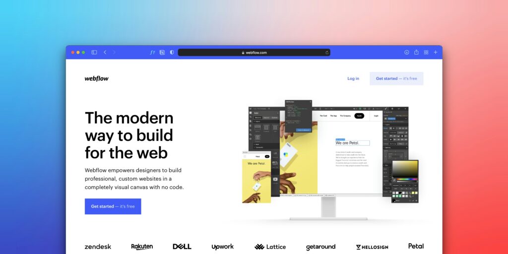
10. Webflow
When you visit Webflow’s homepage, you’ll find a modern web design. This design creates a seamless and attractive experience. Webflow also stands out for its focus on user demand and high-quality design.
What’s the Unique Selling Point of Webflow?
- Dynamic, high-quality visuals: Webflow uses vibrant visuals to attract several users. These visuals may comprise diverse color schemes and geometric patterns.
- Intuitive Navigation: All the webpages on Webflow are easy to navigate because they feature well-designed tabs and clear fonts.
Why Should You Stay Up-to-Date on UI/UX Trends?
When many online brands create a website, they tend to leave it unattended for some time because they do not know their approach is counterproductive and may ignore customer taste changes. If the current UI/UX layout on your website is more than two years old, it may be due for change, and that’s why you need to study what other brands are doing well and replicate it.
If you want to build a successful online brand, it’s essential to stay up-to-date on UI/UX trends but this can be a hassle because trends change quickly. You need to be flexible enough to accommodate new changes.
So, why should you stay up-to-date on the best UI design trends?
- First, as you join the digital space, prepare for intense competition and your website’s user interface is crucial to stand out from the competition. If you look closely, you’ll find that the most prominent websites constantly try to ‘out-design’ each other in an unending competition.
- By paying attention to UI/UX trends, you can ensure that your product or service matches user expectations. It’s a good idea to learn more about user preferences through constant testing, and always ensure your test cuts across diverse generations and demographics.
While it’s essential to stay up-to-date with modern UI/UX trends, there’s a catch. Avoid mindlessly following online trends but ensure your user preferences are what determines your final result. If the final layout discards crucial elements of customer satisfaction, your platform will suffer and you may quickly become like several mobile applications and websites overstocked with unnecessary features.
Conclusion
Successful online branding starts with great UI/UX but it’s easier said than done. As a result, many online brand owners aren’t sure how to create an interactive web design. Sometimes, all you need is to glean some motivation from the bug guys, and there you have them on a platter. Now, it’s time to improve your website!
